Helping visitors understand which hair solution fits their situation
Cèlia Blu is a hair brand offering different hair solutions through certified partners. I designed the website that walks visitors through those options, explains the differences, shows real results and points them to the right next step.
- UX Design
- UI Design
- Information Architecture
- Interaction Design
2025
- Website Design
- Responsive Design
- Design Systems
- User Flows
- Developer Handoff
Making complex choices easier to navigate
Cèlia Blu talks to people in very different situations. Some are looking for a way to add length or volume, others are dealing with hair loss after illness or treatment. The hard part was helping each of them quickly understand which solution applies to them, without burying anyone in jargon or making the medical side feel clinical.
Building the site around real choices, not just visuals
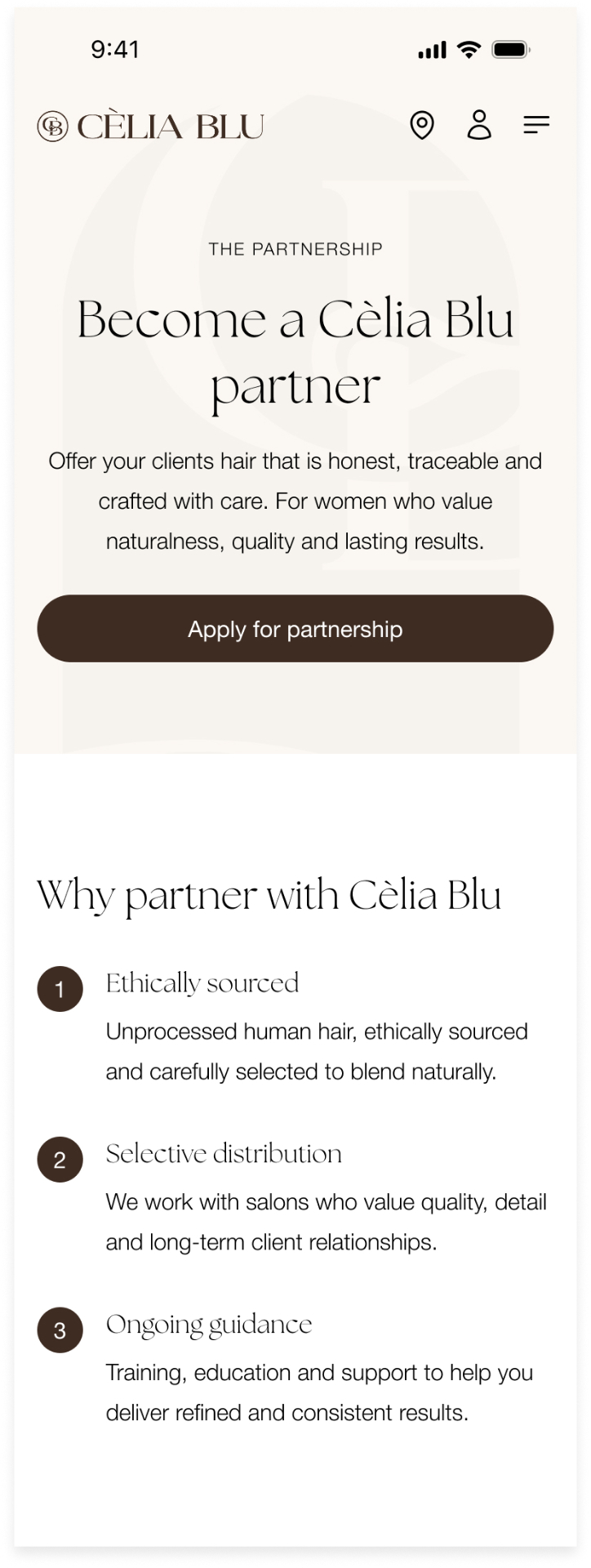
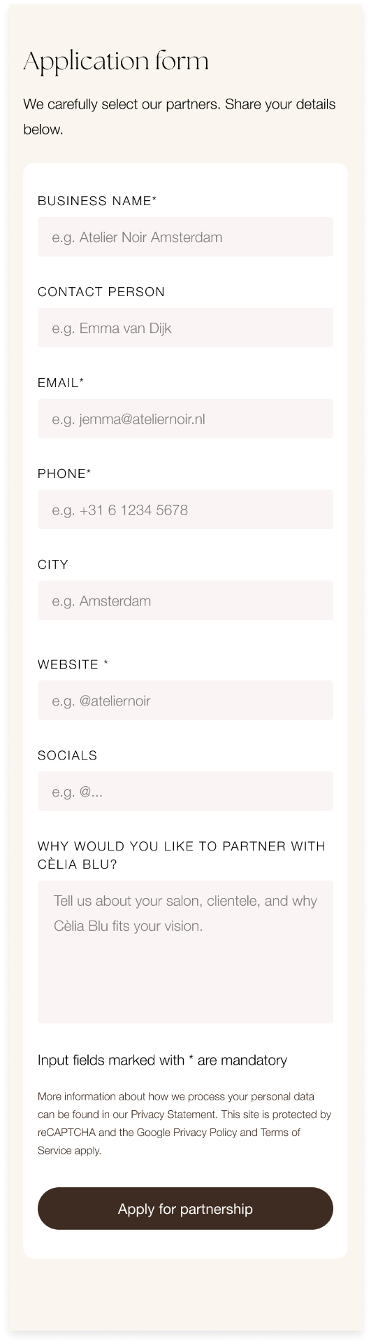
The logo and visual direction came from the client. My job was to turn that into a working system, the typography, spacing, components and page layouts, and to organise the content so each solution is easy to understand and compare.
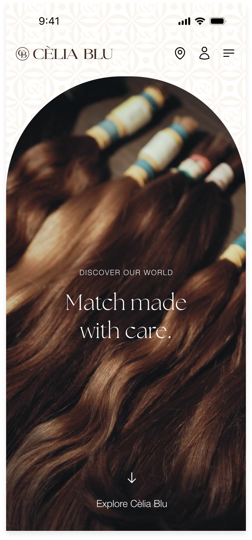
Match made with care.
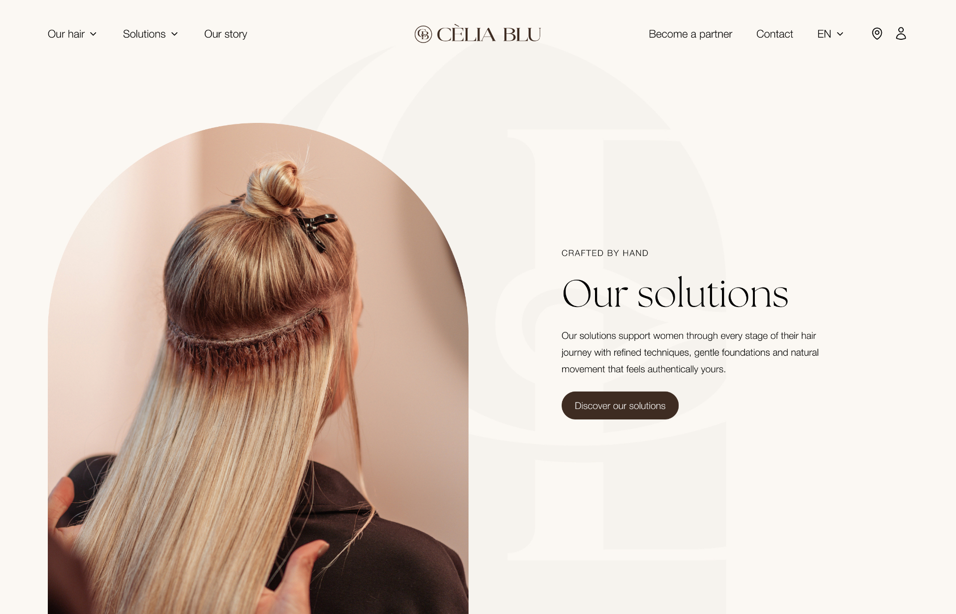
Creating space for visitors to focus on the solutions
I used large type, plenty of breathing room and clear imagery so visitors are not hit with everything at once. Each page introduces one idea at a time, starting with what Cèlia Blu does and the kind of results it gets, before moving into the detail of each specific solution.
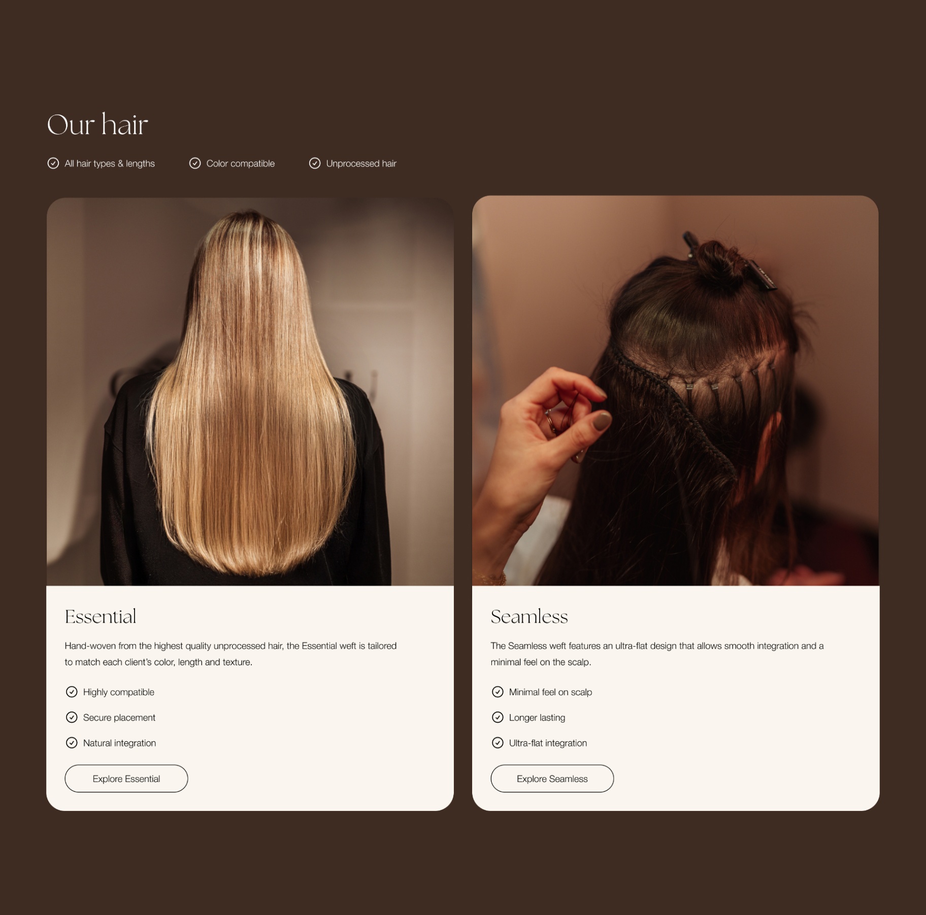
Navigation that mirrors how people actually search
Navigation is where this came together. I organised everything around what visitors are trying to figure out, not around how the products are filed internally. Two menu views work as one system, one for the hair collections and one for the solutions, so the difference between them is clear from the first glance.
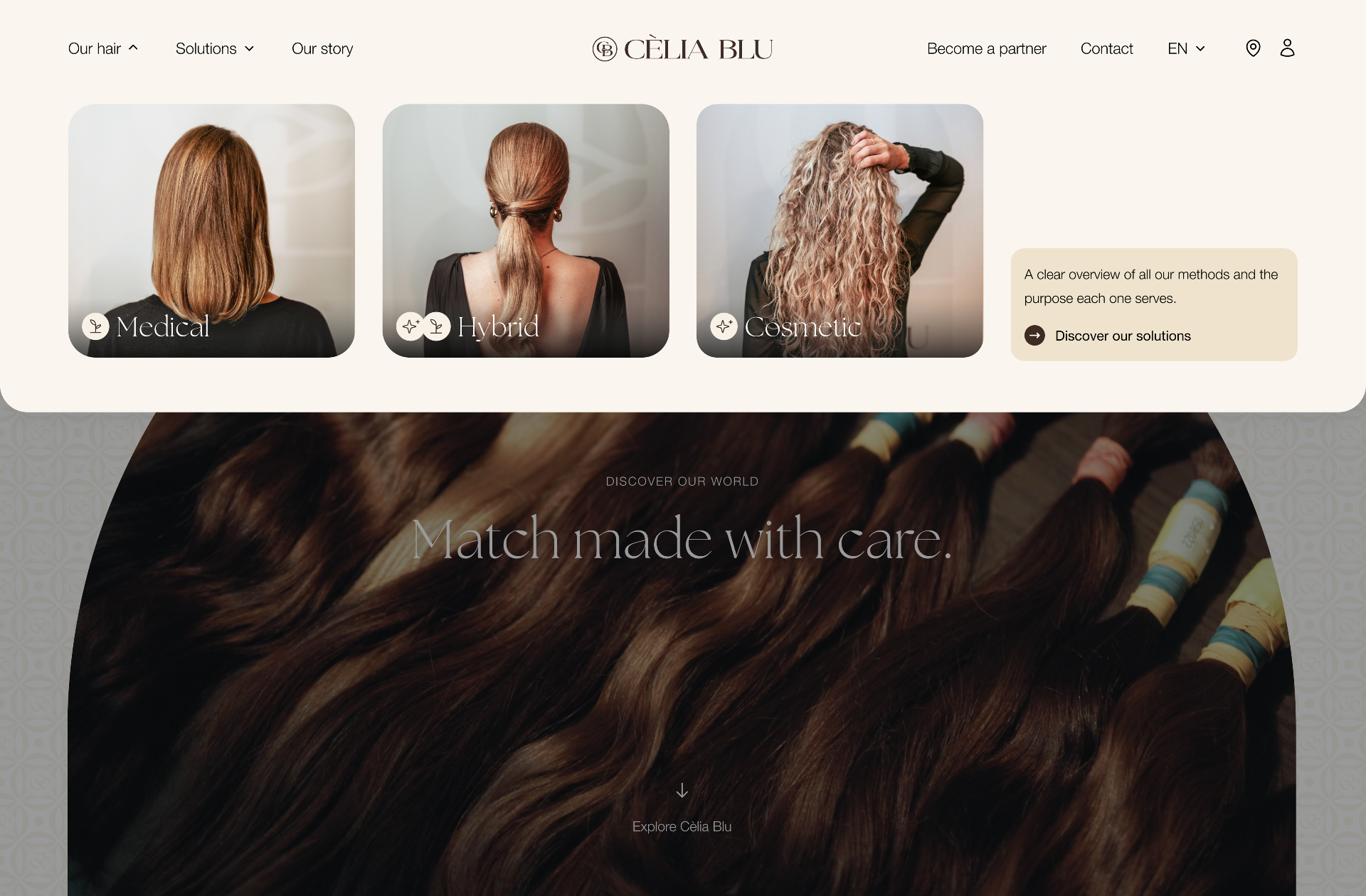
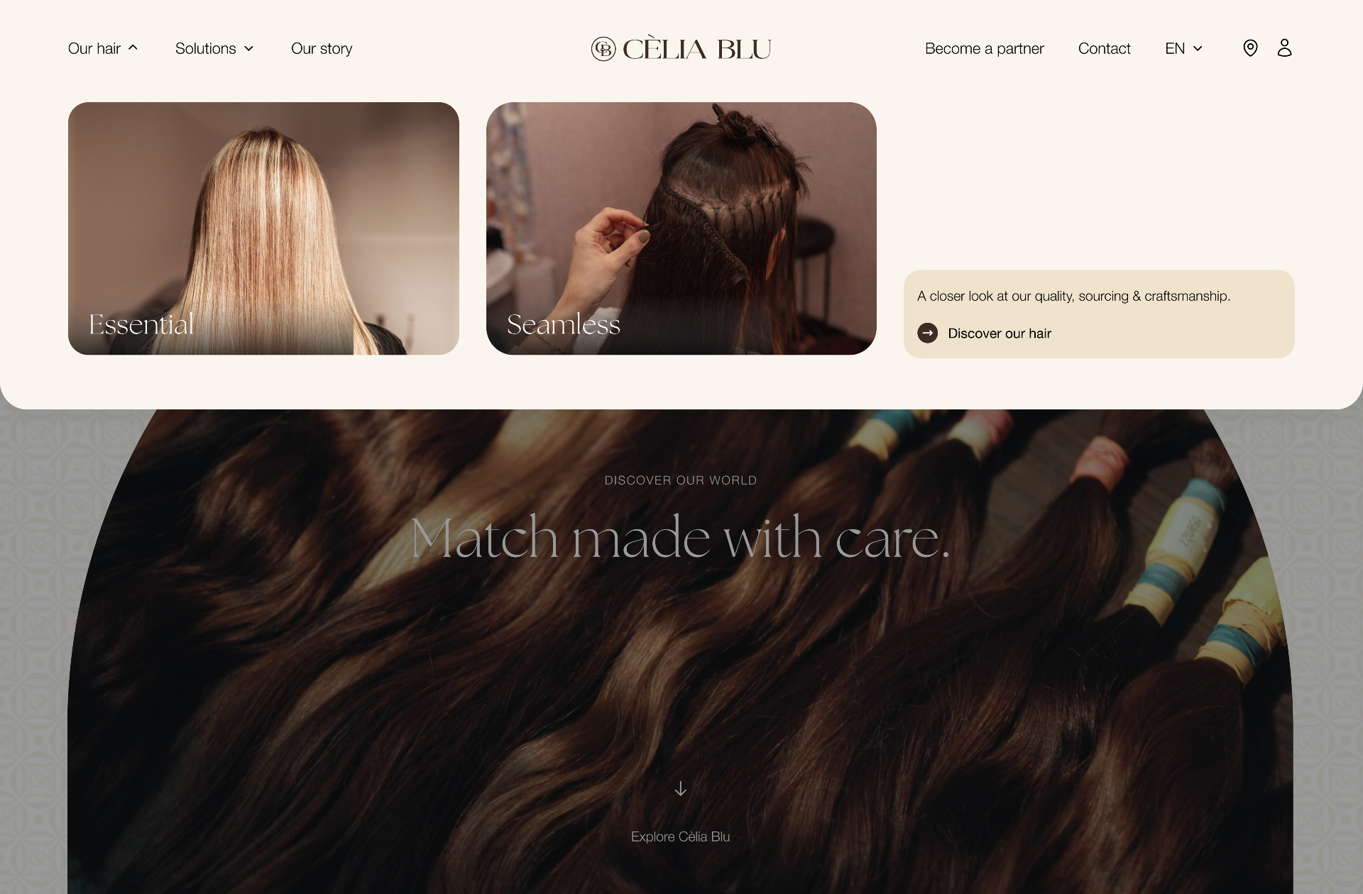
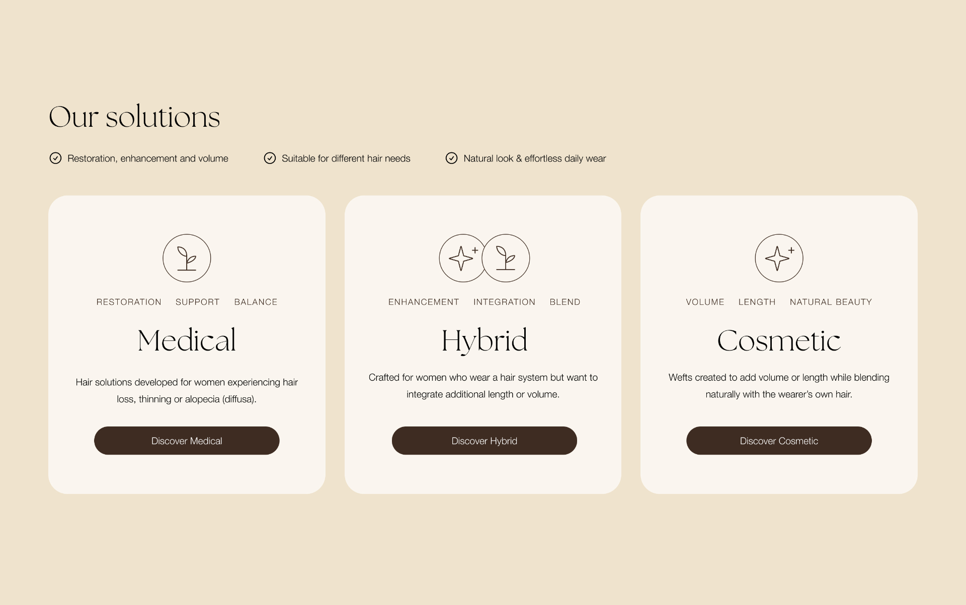
Showing the differences between solutions more clearly
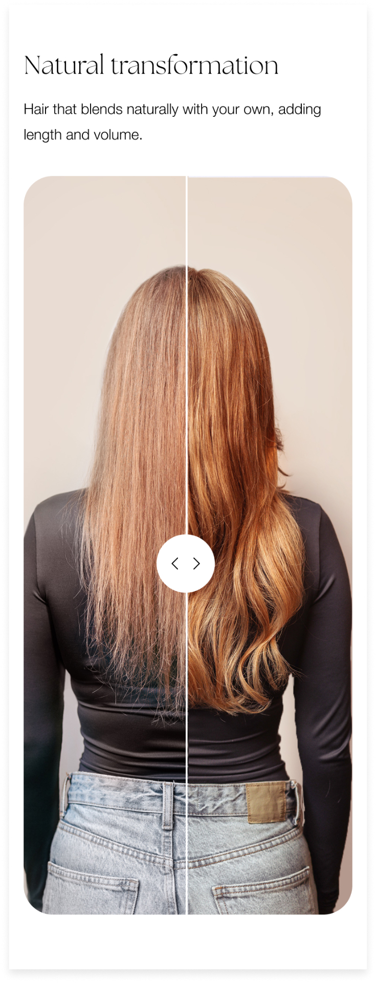
Visitors start by getting a feel for the different types of solutions. From there, each landing page explains who a solution suits, what the process involves and what results to expect, backed up by real before and after examples so people can judge it for themselves.
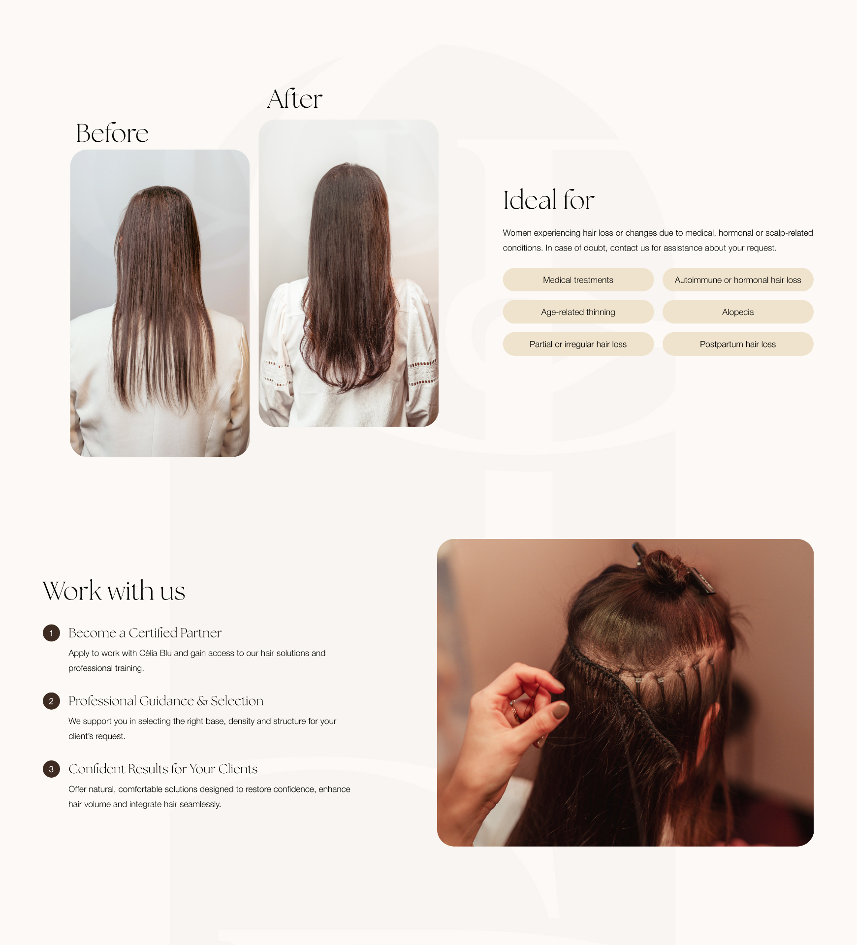
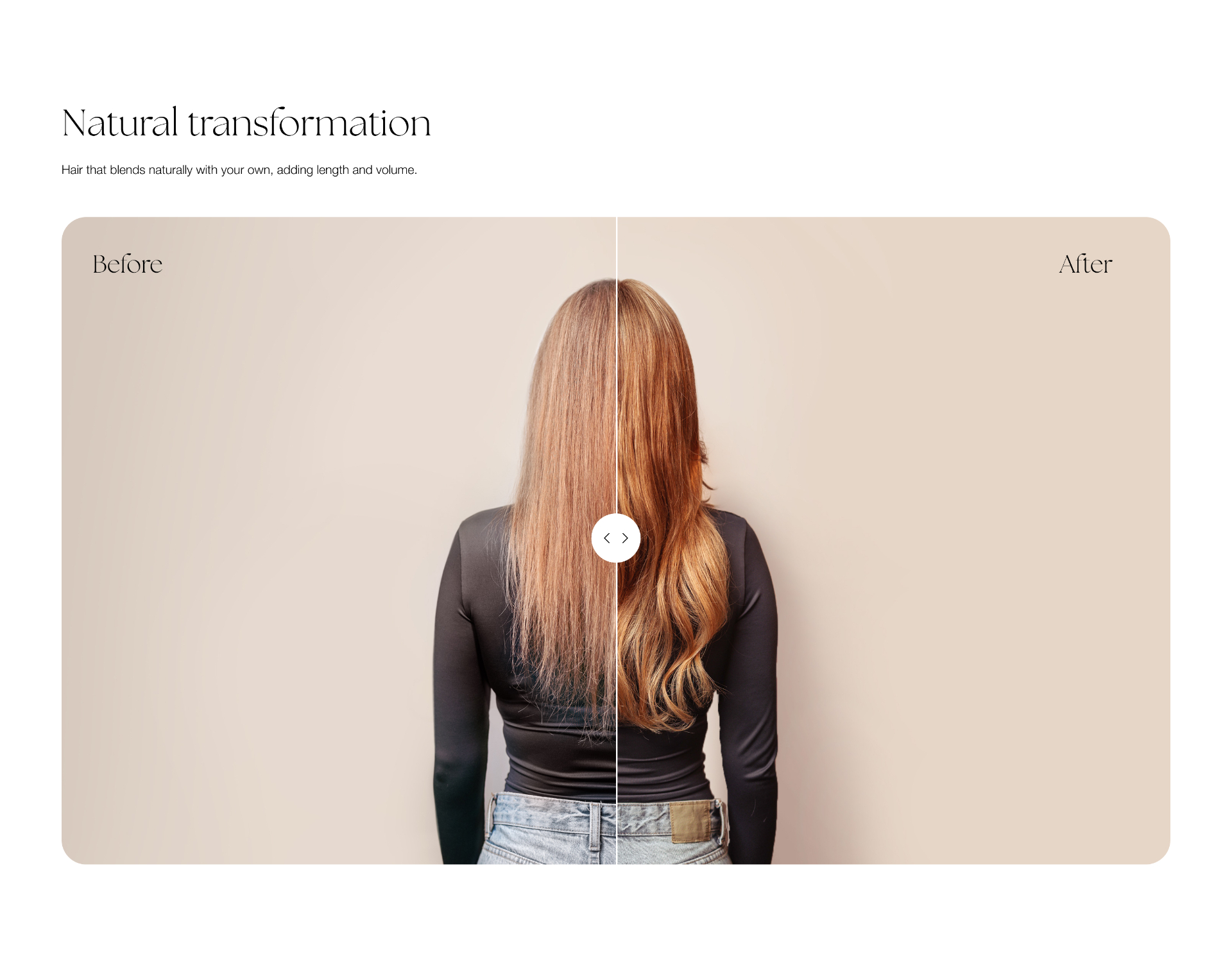
Helping visitors take the next step with confidence
Once someone knows which solution fits, the site helps them find a certified Cèlia Blu partner nearby. A dedicated locator pulls together search, location based results and a map, so the move from reading online to booking a consultation in person feels like one natural step.
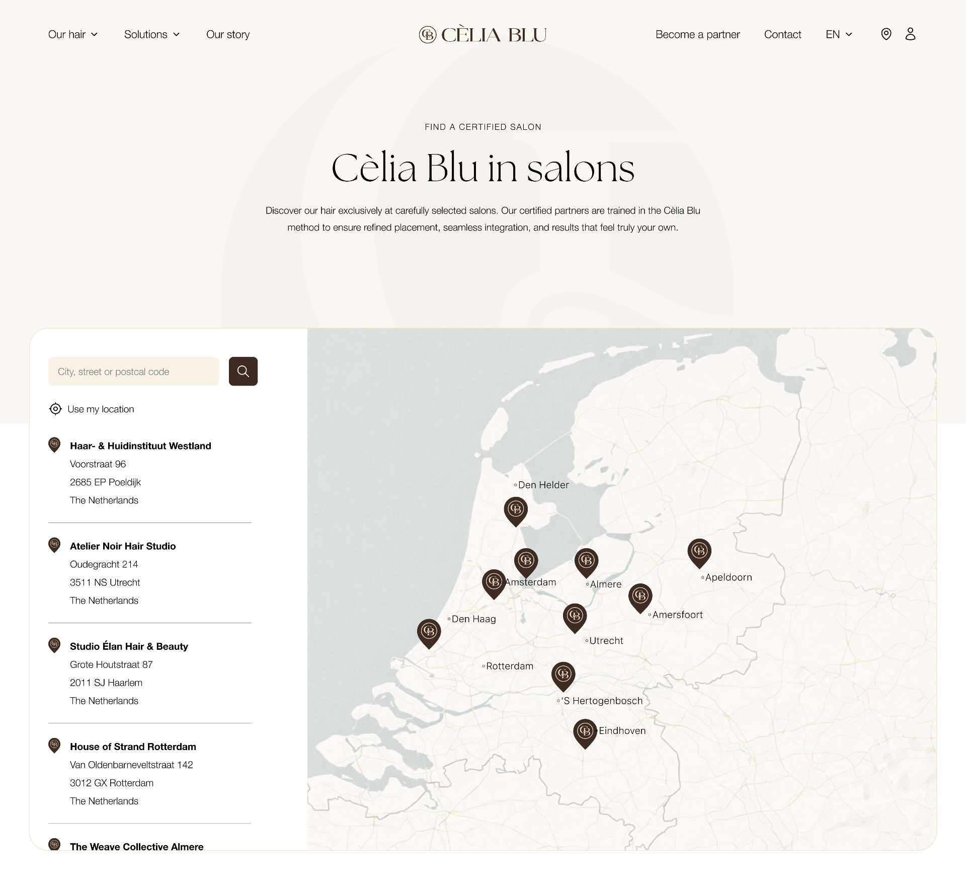
Just as clear on a phone
Most people will land on this site from their phone, often while researching a solution for themselves or someone close to them. I adapted the layouts, navigation and content for smaller screens so the same clarity holds up, and nothing important gets lost on the way down to mobile.