Albert Heijn In-Store Navigation
Helping shoppers find products with more confidence inside larger supermarkets.
Role
UX Designer
Timeline
2025
Responsibilities
- Research
- Journey Mapping
- Concept Development
- Interaction Design
- Usability Testing
Finding products shouldn't slow shoppers down
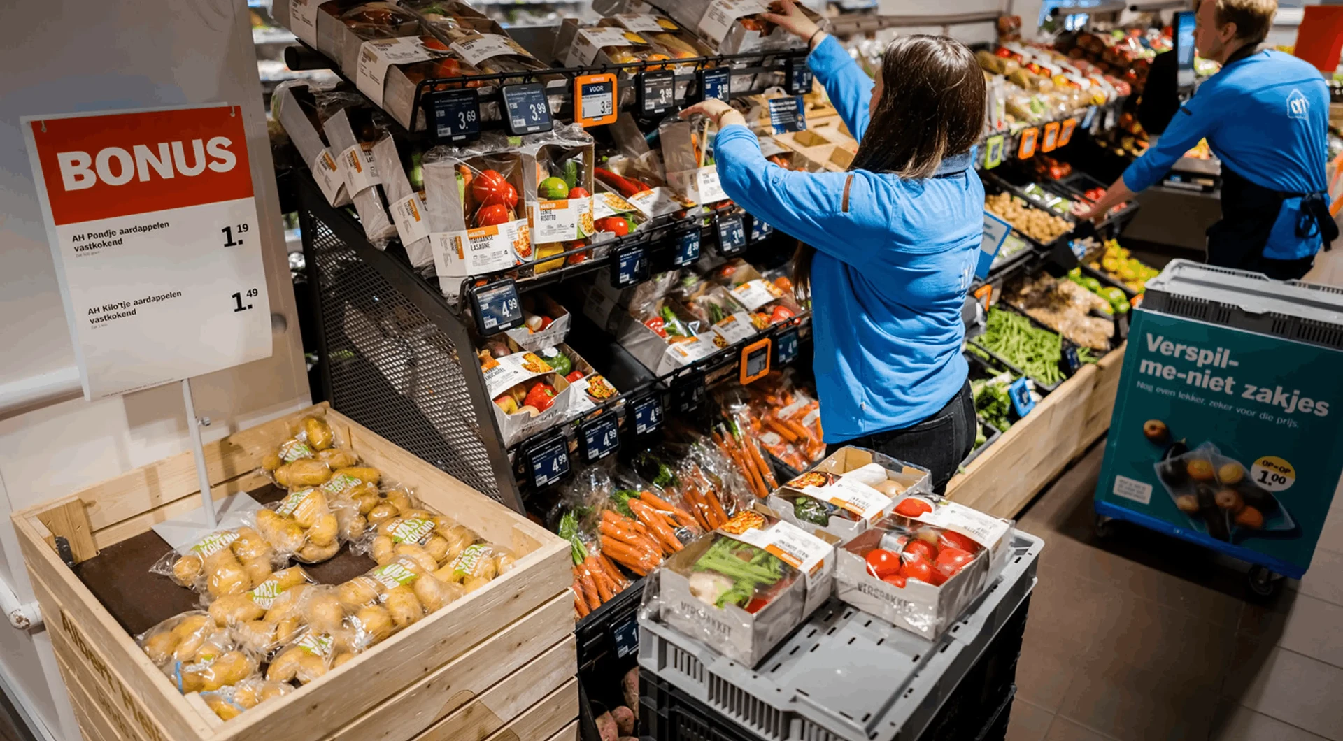
In the bigger Albert Heijn stores, finding a product kept breaking people's flow. They'd slow down, look around for a sign, and sometimes walk straight past the aisle they needed.
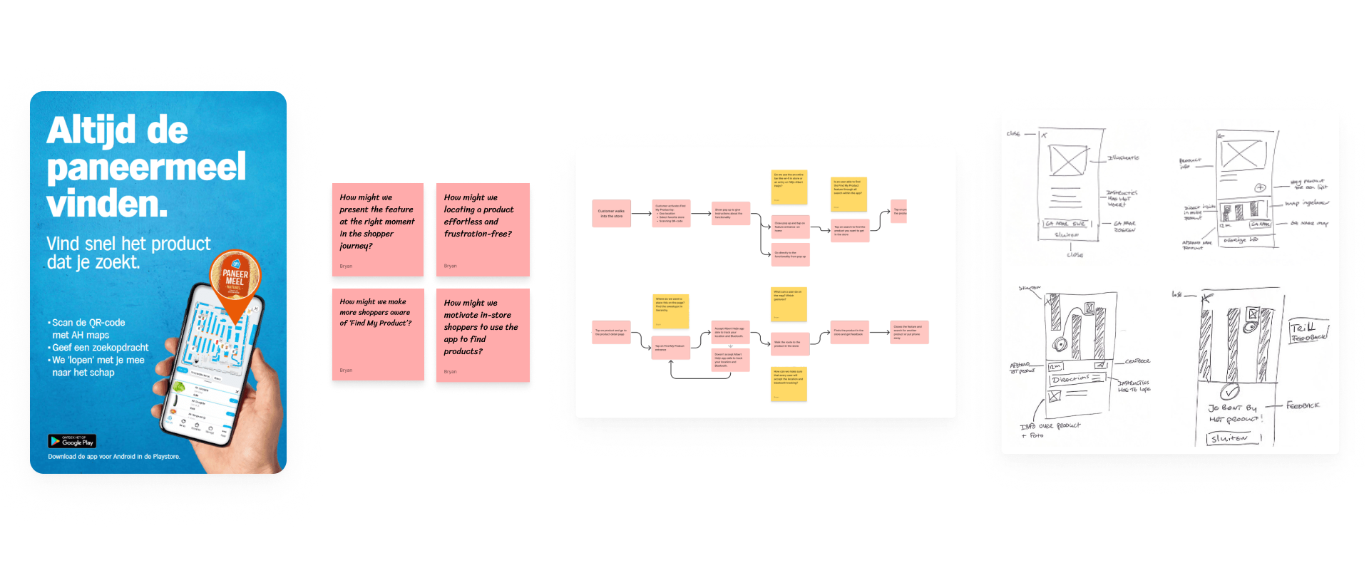
I spoke to shoppers and mapped out the whole journey, and one thing stood out. People weren't asking for detailed indoor navigation. They just wanted a bit of reassurance that they were going the right way.
What the research told us
- Shoppers needed reassurance more than precision
- Most uncertainty happened during transitions between locations
- Complex navigation increased hesitation
- Shelf-level confirmation improved confidence
Guidance at the moments that matter
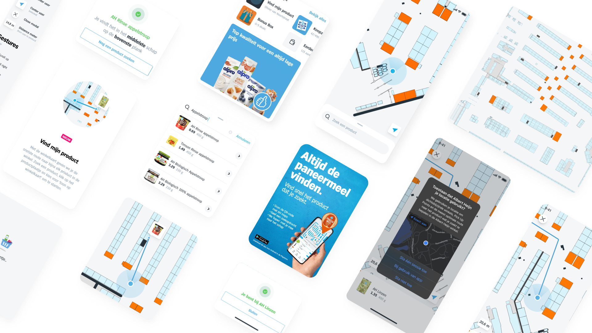
Rather than building a feature-heavy indoor map, I zoomed in on the few moments that actually made people feel unsure while looking for a product.
The concept gently guides shoppers through the store with light navigation and a clear bit of confirmation right when they need it.
Four focused components
Product Search
Search for products and instantly see where they can be found.
Route Guidance
Simple guidance helps shoppers move towards the correct aisle.
Shelf Positioning
Additional context helps users identify the right shelf section.
Arrival Confirmation
Clear confirmation removes uncertainty during the final step.
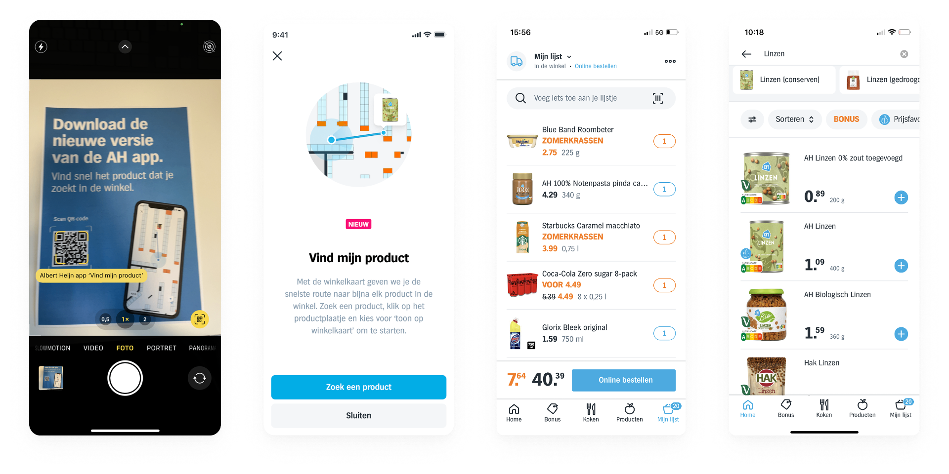
The end-to-end experience
On their own, each piece solves one small moment of doubt. Put together, they turn into a single, continuous experience: you search for a product, you get pointed towards the right aisle, and you get a clear confirmation once you reach the shelf.
Product search kicks things off, route guidance keeps you moving the right way, shelf positioning narrows it down, and arrival confirmation wraps it up. Each step quietly hands over to the next, so it feels like one smooth flow instead of four separate features.
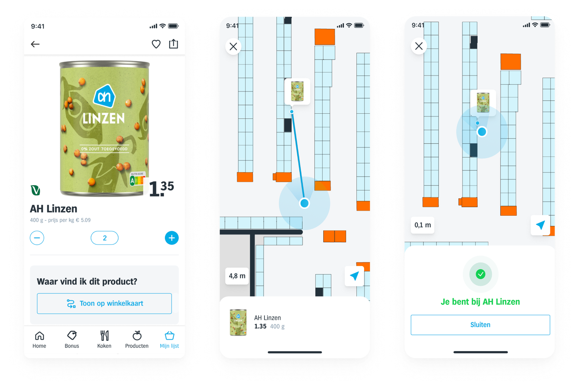
From finding a location to confirming a product
In early testing, people had no trouble getting to the right aisle. What surprised me was that a lot of them still paused at the shelf, double-checking whether they'd actually grabbed the right product.
That changed how I looked at the whole thing. Instead of just helping people reach a spot, the design needed to give them confidence at the exact moment they decide.
- People didn't need more navigation. They needed to feel sure they'd found the right product.
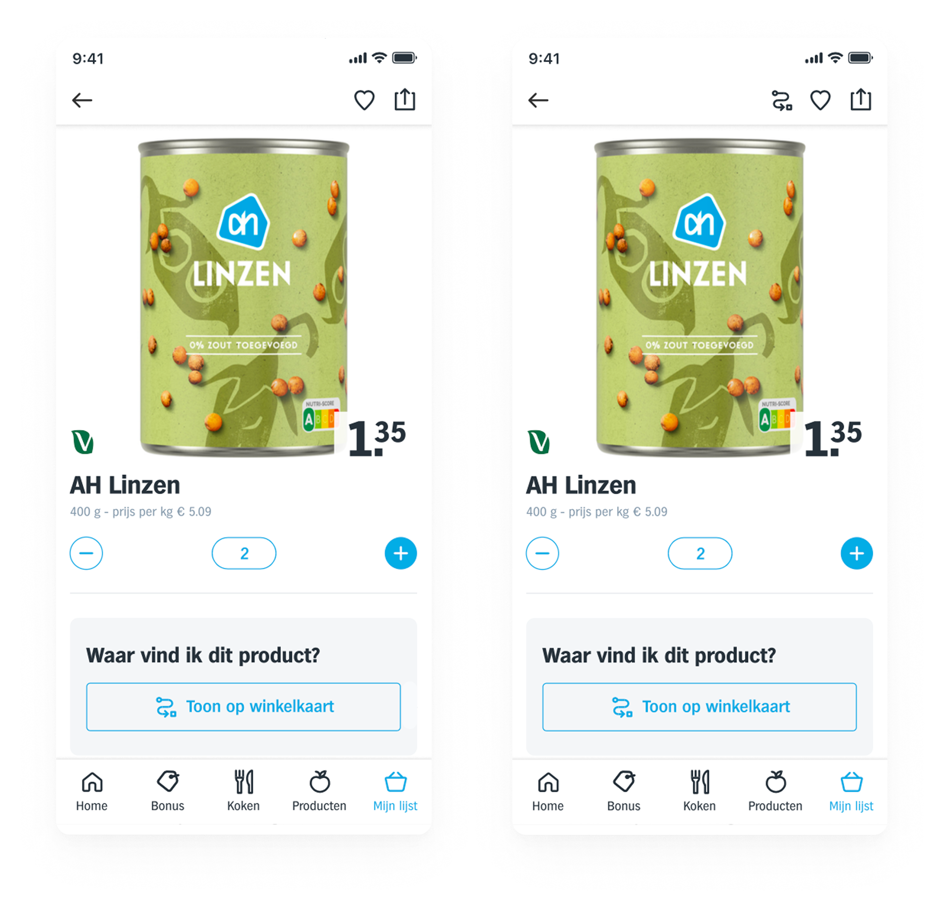
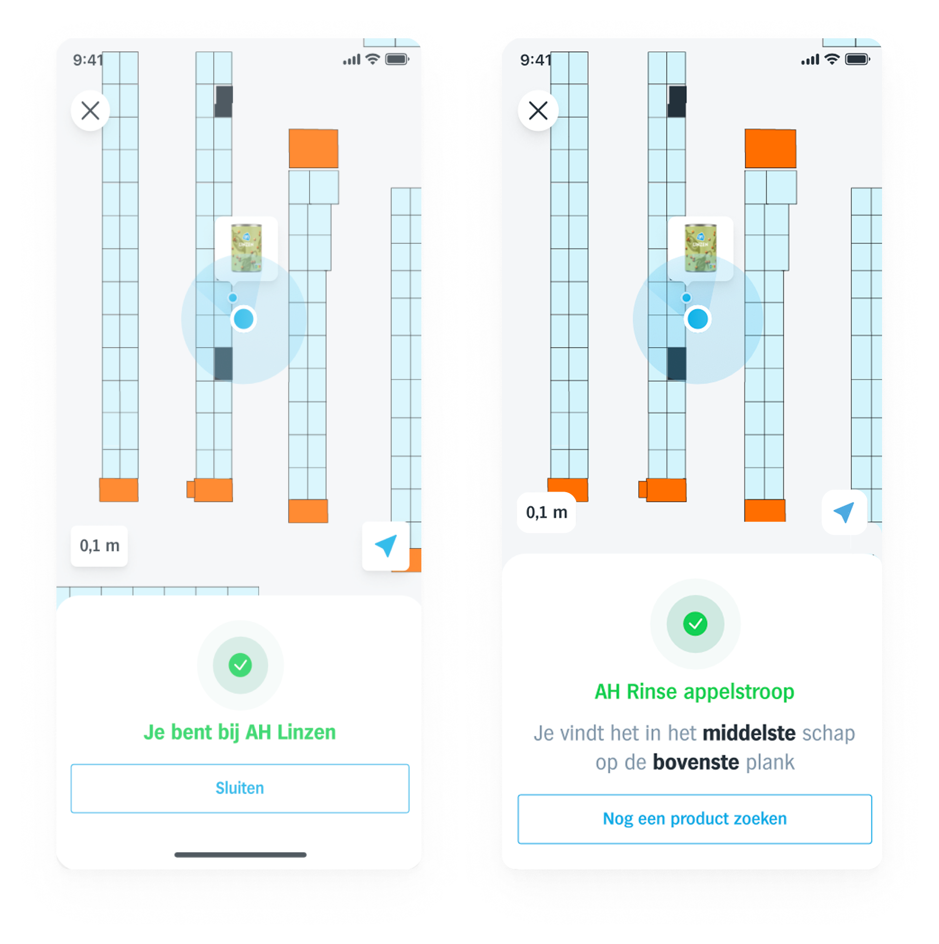
Small moments of clarity, big impact
This project really showed me how much a few small moments of clarity can change the way shopping feels.
By going for confidence instead of precision, the whole thing felt quicker, simpler and a lot more natural to use.
- Less hesitation while looking for a product
- More confidence around the shelf
- Fits naturally into how people already shop